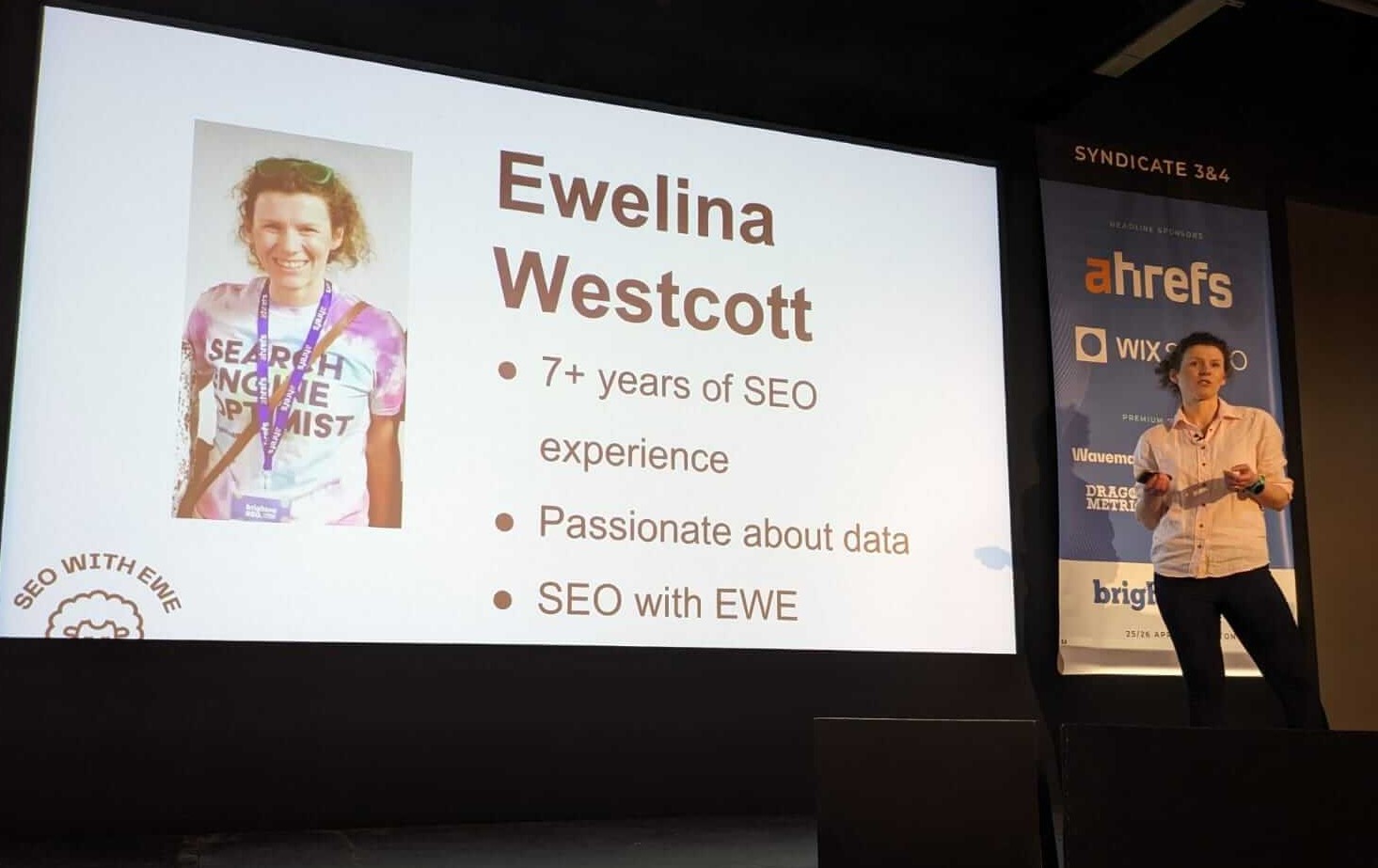
On 26th April 2024 I spoke at BrightonSEO’s MeasureFest about the data analysis skill gap among SEO professionals. If you missed my talk you can view the slides on SpeakerDeck.
So, are SEO analysts real data analysts?
SEO analysts already wear multiple hats, from actual search engine optimisation tasks to a wider range of digital marketing tasks (copywriting) or developer tasks (HTML and/or CSS changes). Why should we even care whether SEO professionals mastered yet another skill?
Firstly, data is everywhere: from the number of coffee cups you drink to get you through Monday reporting to the number of tears you shed over yet another Google Algorithm Updates. But also in the most common SEO tasks: from keyword research metrics (search volume, keyword difficulty, CPC) to Google Search Console’s impressions, clicks, average click-through-rate and average position, and sessions, conversion rate, engagement rate etc from Google Analytics. We are immersed in data.
Secondly, it’s an integral part of an SEO’s life. I sent out a survey to better understand daily tasks of SEO specialists. Some of the most frequently mentioned tasks were: keyword research, competitor analysis, reporting, conversion rate optimisation, backlink profile analysis, technical audits, reporting, which implies that SEOs do work in data on a daily basis.
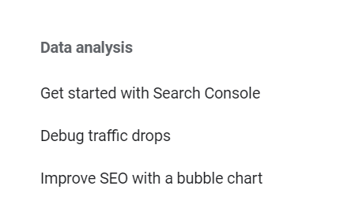
Thirdly, because Google say so. When you navigate to Google Search Central (previously known as Webmasters), you’ll notice that Data analysis has been added to Google Search Central sometime last autumn.
If you’re not familiar with Google Search Central and you work in SEO, I’d highly recommend familiarising yourself with it for Google’s recommendations how to improve your SEO performance: from crawling to ranking and all the topics in-between.
When I started my SEO career in 2017, data analysis wasn’t included in Google’s documentation aimed at helping website owners and SEO specialists. Nowadays, Google advises how to debug traffic drops or how to improve your SEO with a bubble chart. Back in 2017 I didn’t even know bubble charts existed, let alone how they could be used to boost SEO performance.
And, if you you need to assess a previous version of a website, or investigate legacy changes, you can easily do it with the WayBack Machine. Make sure you add it to your SEO toolkit.
Additionally, the expectations from the job market. I found a vacancy for an SEO Analyst position on LinkedIn. Let’s review some of the skills required:
- data analysis
- data visualisation
- dashboard creation
- data ‘translator’ (whatever that even means)
- SQL knowledge – If you’re not familiar with SQL, and why should you be as an SEO specialist?!, SQL stands for Structured Query Language and it’s a language for accessing and manipulating databases. Imagine Excel on steroids.
- Tableau experience – Tableau is a visualisation tool (think of Google Looker or Google Data Studio as it’s been previously known as) alternative one is PowerBI.
Another example of SEO Analyst requirements comes from an Indeed job description and some of the requirements are:
- data analytics
- web analytics
- analysis skills.
Expectations from the current job market are high. Let’s see how they stack up against the reality.
As mentioned earlier that I sent out a survey to my fellow SEO professionals and according to the results:
72% of SEO analysts have not had any data analysis experience
prior to starting their SEO analyst role.
Which is perfectly fine. A new role should offer you room for growth and development.
However, 81% of respondents did not receive any data analysis training, despite the role involving data analysis tasks, e.g. keyword research, reporting, which raises a question how were they able to perform their duties successfully.
Additionally, 20% of respondents were not able to differentiate between dashboards and reports, although being responsible for reporting. It’s mind-blowing.
How to be better SEO analysts?
So, let’s be better SEO analysts. How? Well, I’m glad you’ve asked.
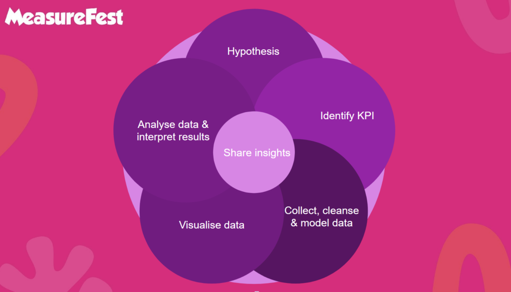
Hypothesis
First of all, when working with data, define your objective. Articulate your hypothesis which will help you answer a business challenge you’re working on. By articulating a hypothesis you’ll be able to focus on the relevant data that may have the biggest impact and stop yourself from going down a rabbit hole. Even if your hypothesis evaluates over time, you should still have solid foundations for your analysis.
A potential scenario: one of your clients running a local brick and mortar business suspects a drop in traffic and would like you to investigate it. Your hypothesis may be something along the lines of: has there been a drop in organic traffic?
KPIs
Then decide what metrics you’ll use to prove or disprove your hypothesis. Going back to our potential traffic drop. If the website has experienced a decrease in traffic, we will use clicks to measure it.
Data collection, cleansing and modelling
After creating our hypothesis and establishing KPI(s), we can collect, clean and model (if necessary) our data. Since we’re investigating a potential traffic drop, we will be using GSC click data. Taking into consideration that our client is a local business we will only be focussing on the target market and remove (cleanse) redundant data. Some of data other cleansing techniques include:
- trimming extra spaces
- removing duplicates
- removing corrupted data
- using the proper formula for uniformity
- adding/removing columns
And modelling data – creating a a visual representation of either a whole information system of parts of it to communicate the connections between data.
Data visualisation
By visualising our data we should be able to answer our questions, draw insights in a much easier way.
Data analysis
Once we have our visuals (charts, graphs, tables etc), we are able to analyse our data in a much easier way, spot patterns, trends over time and draw insights.
Interpreting results
After out analysis is completed we can interpret the results and answers the following questions: What does the data say? So what? What does it mean? What happens next?
Going back to our potential traffic drop example we can either conform or deny a decrease in traffic. If a website hasn’t suffered a decrease in traffic, job done. You can reassure your client that the traffic drop they are seeing in GSC performance report was not affecting their target market.
If there has indeed been a traffic drop, we can investigate further: what caused the drop? Was it a certain URL or a group of URLs affected? Has the position of click-driving queries decreased or has the CTR been weaker? Has the drop been caused by seasonality, etc?
Communicating results
By now, we have our answer and we are ready to communicate the results and insights to your client(s)/stakeholder(s). It should be done in a way that will be easily understood by your audience.
The data analytics life cycle
And this is how we completed the so-called data analytics life cycle. We created our hypothesis, set KPIs, collected, cleansed and modelled data, which we later visualised and analysed. That allowed us to interpret the results and communicate them.
Data Visualisation Top Tips
Although data visualisation is a part of the data analytics life cycle it’s a vast topic that could be covered in a separate post. I gathered top tips to help you create better graphs, charts and dashboards. I’ll be using my potential traffic drop example.
Declutter your visual
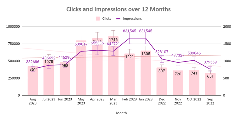
Less is more so declutter your visual. If an element does not serve a purpose – get rid of it. There’s no need to use every single element available and we also don’t want to overwhelm your audience and add to their mental workload. You can easily remove gridlines, callouts, trendlines etc
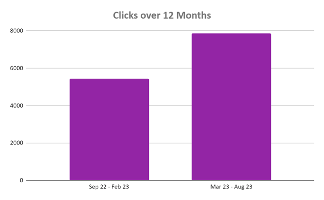
Organise your data
It shouldn’t require additional mental resources to decipher your visual.
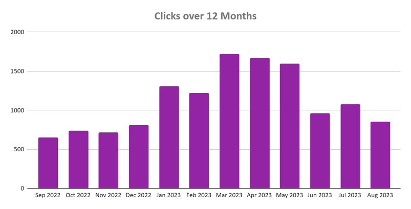
Not only have I removed redundant elements but I also organised the data in a chronological order.
Use the right visual
By using the right visualisation format you’ll increase the chances of your audience understanding the message you’re trying to convey.
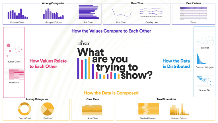
To compare values to each other – use column charts, bar charts, line charts or tables. Depending whether you’re comparing values among categories, over time or displaying exact values.
To showcase data composition choose from donut or pie charts, area chart or stacked columns or percentages.
Box plots, column histograms and scatter plots are great to visualise data distribution and to present how values relate to each other, use either bubble charts or heat maps.
Be uniform
Stay consistent with fonts, colours, sizes to minimise metal overload. You can easily improve the readability of your visual by using seven or less colours and by paying attention to the legend positioning.
Split the visual
If necessary, split your visual into multiple ones to make your data easier to interpret.
Use the right language
Avoid jargon or language that may confuse your audience and hinder their ability to understand the message you’re trying to convey.
Going back to my potential traffic drop example, I opted for a column chart instead of a time line to stay aligned with GSC and 6 month over 6 months comparison.

Let’s be better SEO analysts.
You can find the full deck on SpeakerDeck. If you’d like to chat about SEO, data or data in SEO, please reach out.

